
When was the last time you gave your personal or business website a proper top-to-bottom refresh or rebuild? Has it primarily looked the same for the past two or three years? Might it have looked virtually identical for the past five years or more? Don’t feel guilty about answering ‘yes’ to that question. The majority of website owners are just like you. They invest time and money into getting their website set up, and from that moment on, they do nothing with it other than uploading new information or content. The text on their websites might change from time to time, but the website’s look and feel never does. That’s not great for sparking interest from customers.
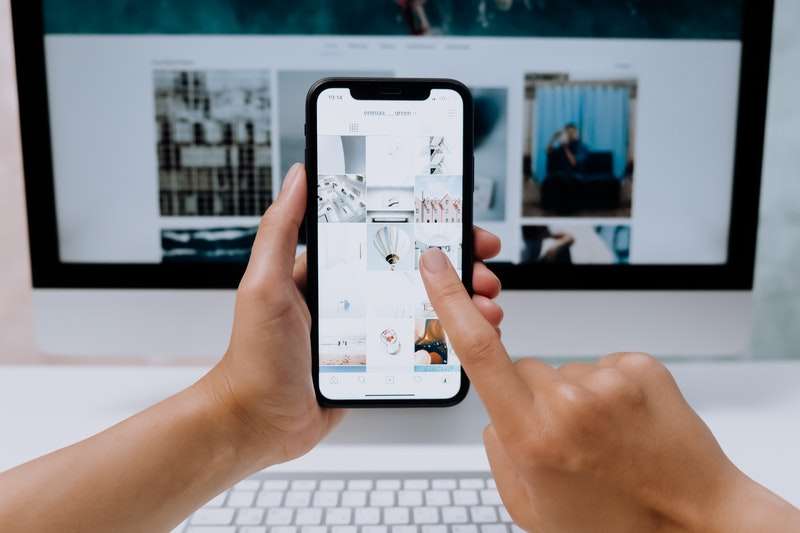
Just as is the case with clothes or home design, trends come and go on the internet. What was considered a good look for a customer-facing website in 2010 would look dated and behind-the-times today. No website should go without a ‘fresh coat of paint’ for more than three years, and so if yours has, 2021 is the year to make changes. We realize you might not know where to start with that suggestion, but that’s what you come to our site. If the time has come to ring the changes for your site and you’re wondering what the right look for 2021 will be, so you can hire a web design agency from Vancouver as they have updated with the latest design all time.
Voice Control
It’s been more than eight years since Google introduced voice searching for the first time, and it’s only with hindsight that we can see exactly how ahead of its time that idea was. The feature was barely used for the first few years of its existence, but that was before people started buying smart speakers for their homes. The voice search-led SEO revolution of 2019 that some reputable websites predicted failed to happen, but 2021 is looking much more likely. More and more people use their phones or tablets to land on your homepage, so they don’t come armed with keyboards. As the public becomes more comfortable with asking their Amazon Echo Dot basic questions and getting spoken responses, they’ll come to expect the same of the websites they visit. That means it would be a good idea to get ahead of the times by introducing a voice interface for your website today.
Minimalism
Every year, an edgy writer somewhere on the internet predicts that the coming twelve months will see an end to minimalism and a return to the chunky, multicolored websites of the past. Every year it fails to happen. Minimalism isn’t just a trend – it’s a desirable way to formulate and organize a website. Using the best elements of minimalist design, you can showcase the things you truly want your visitors and customers to focus on. You needn’t look any further than online slots websites if you’re going to see evidence of this.
It’s probably fair to say that no internet-based industry does a better job of making money quickly than online slots websites. The one design feature that all of the most popular slots site within that industry have in common is minimalism. All you’ll see on such a site’s homepage is a well-positioned set of online slots set against a mostly-plain background. There are no distractions, and there’s no confusion about what visitors should be looking at. If you have ‘core content’ that you want visitors to focus on, strip away all distractions.
Dark Mode
We don’t know why web designers took so long to work out that people don’t like having their eyes scorched by plain white backgrounds. They’re hard to see when the sun shines on them, and they’re doubly annoying at night when you’re browsing websites on your phone screen with the lights turned low. The solution to the problem is ‘dark mode,’ and it’s the easiest of all the changes you could introduce to your website this year. Even Facebook finally got around to introducing a ‘dark mode’ in mid-2020, and if that enormous, slow-moving social media website can manage it, so can you. The most significant advantage of the dark mode is that it’s easier on your visitor’s eyes, and so they’re likely to spend more time browsing your site. Nine times out of ten, it also looks more attractive than ‘light mode’ or ‘day mode’ anyway, so perhaps consider asking yourself if your site should be ‘dark’ by default.
Horizontal Scrolling
You’ve probably come across the phrase ‘below the fold’ concerning web design before. It’s a term borrowed from the old days of broadsheet newspapers and refers to all of the text that appears before the fold that marked such the publications’ halfway point. All of the more important stories were positioned before the fold because that’s where they’re more likely to be seen. Stories printed below the fold tended to be more trivial. In web design, the ‘before the fold’ point is the portion of your homepage that visitors can read without scrolling down to continue reading. Research and experience tell us that the vast majority of users don’t do so, and so the majority of the content beneath that point goes unnoticed and unread. To counteract this problem, consider building pages that scroll sideways instead. It might seem counter-intuitive – and perhaps even a little untidy – but visitors are more likely to scroll across to continue reading than they are to scroll down. Don’t ask us why – you’d probably need a psychologist for that – but it works.
Fast Loading
This factor makes more difference than any other when it comes to a commercial website’s success or failure. It doesn’t matter how attractive or informative your website is if it takes five seconds to load it. Most visitors aren’t willing to stick around for that long. As the average net connection speed has got faster over the past twenty years, our collective patience has dipped. People expect pages to load within a maximum of two seconds of entering a URL or clicking on a link. If it doesn’t, they’ll likely give up and go looking for something else instead. That might sound crazy, but it’s true. Even if you change nothing else about your site in 2021, strip down what you have and adjust it until it can be fully loaded in a second or less. You’ll retain a lot more visitors that way – and that’s one step closer to turning visitors into customers.